


AMCES Rebrand
AMCES is an association management firm based in Ottawa, ON that works with national and international not-for-profits to help run their organizations and events. The goal for the rebrand was to modernize their brand to better reflect their professionalism and forward thinking business practices.
Objective
The client's rebrand objectives were to have a modern look and feel, provide a feeling of advancing and improving, and to transition to the AMCES acronym. They also wanted the new logo to feel connected with the original logo by having a similar triangle symbol as it is widely recognized within their field.
Process
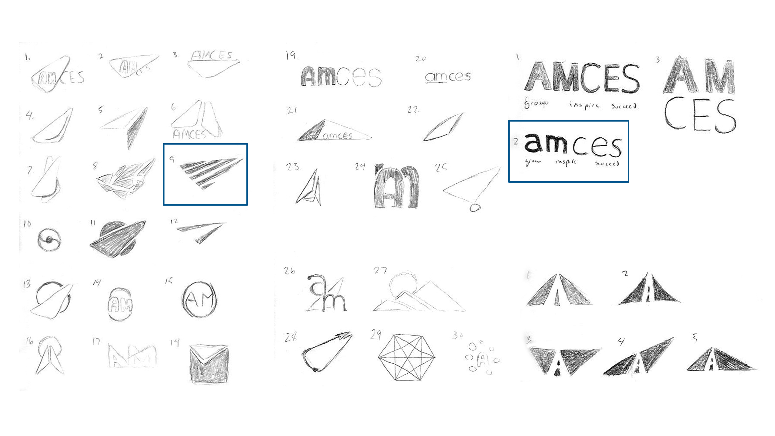
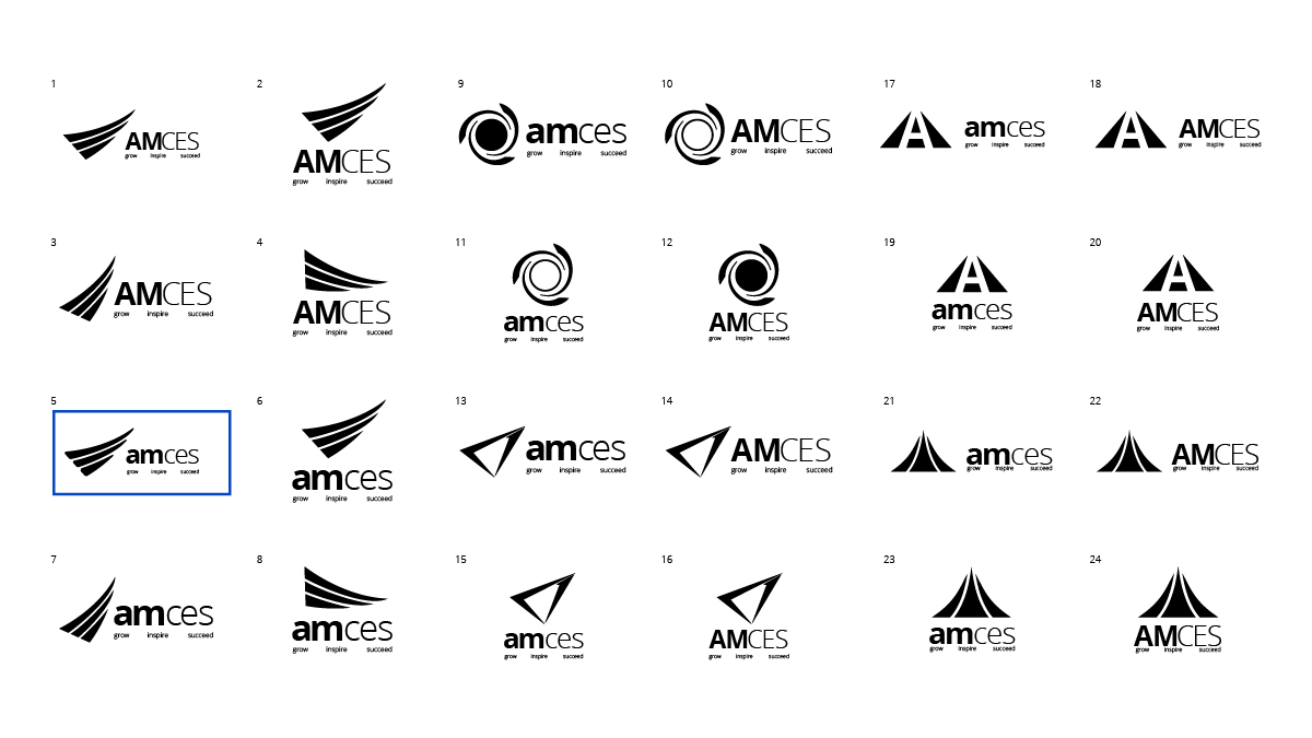
The branding process began with the creation of the new logo. I created a number of iterations of symbols based on the original blue triangle concept aimed at capturing the feeling of advancing, improving, and creating forward motion.
Sketched Concepts
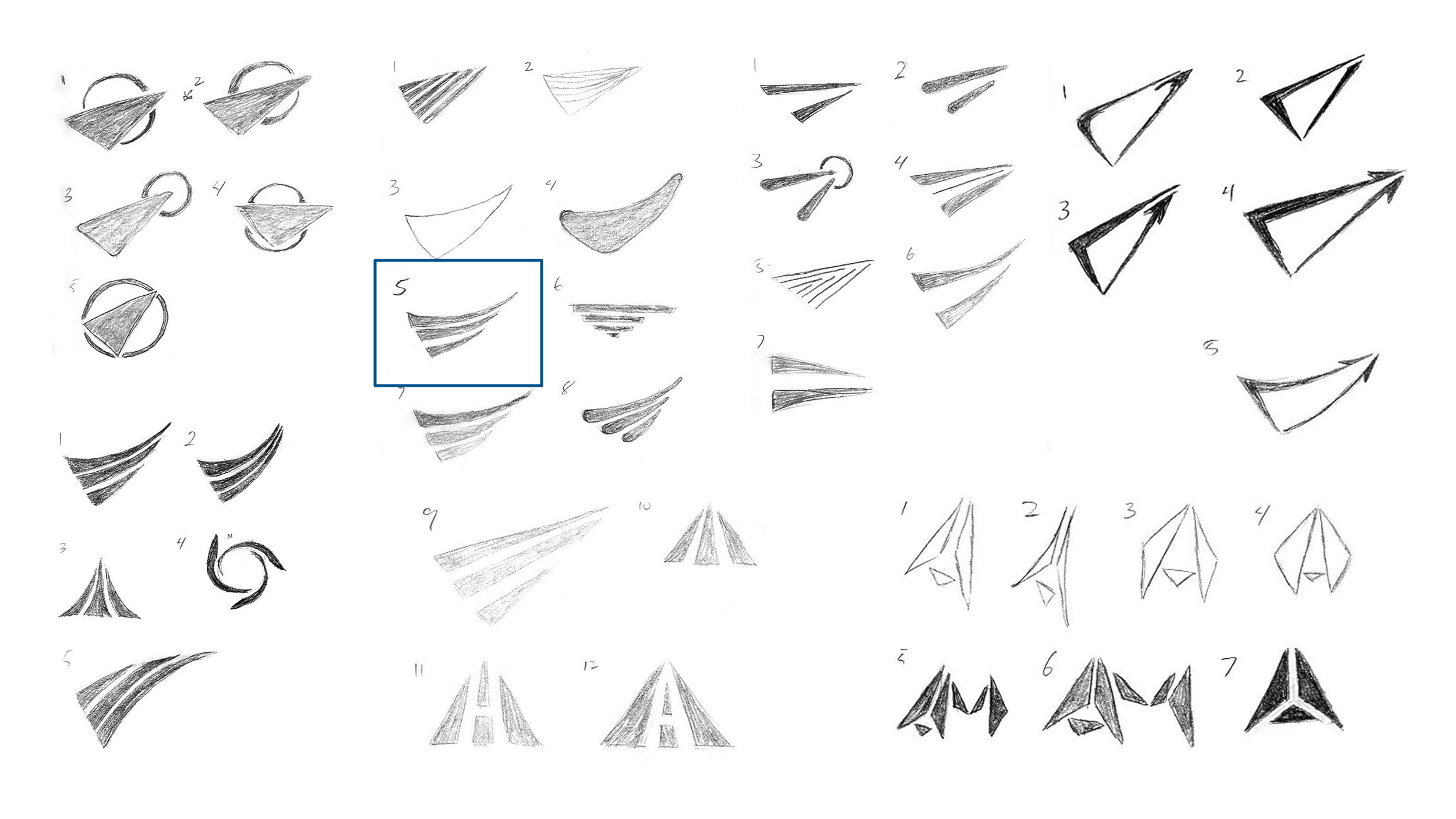
Final Concepts
Design
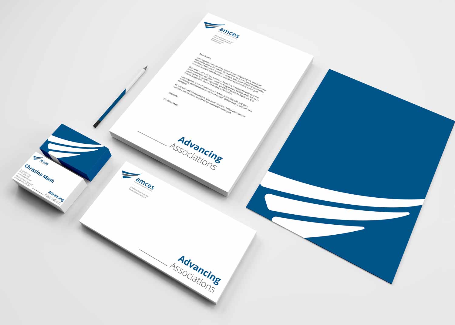
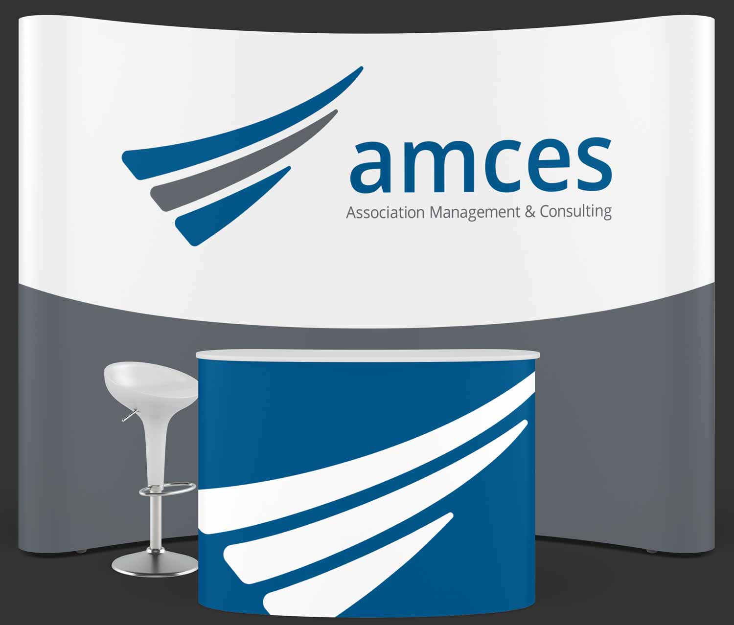
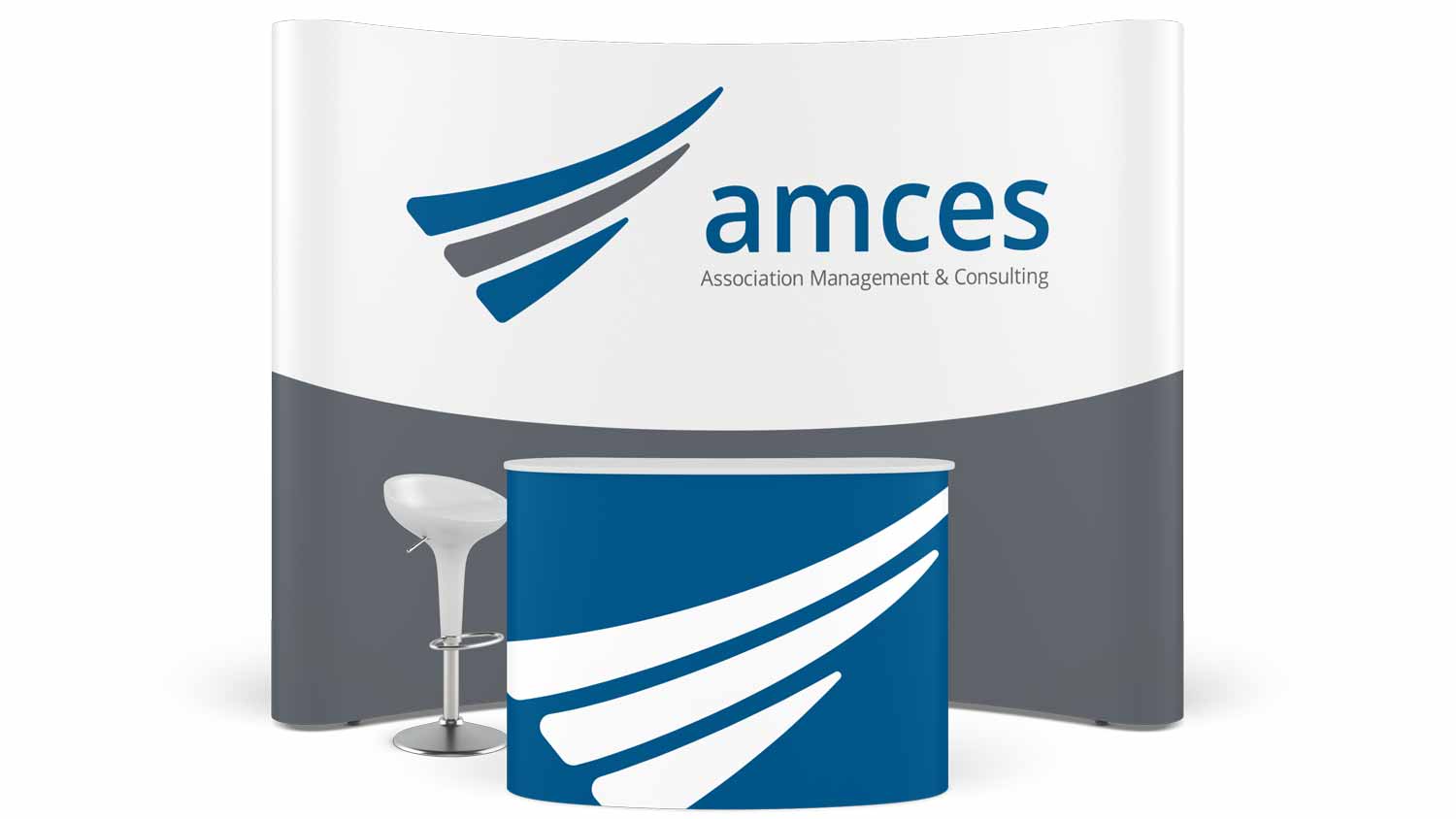
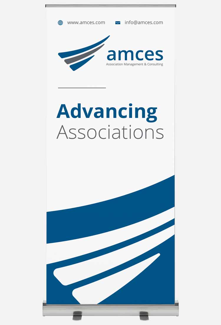
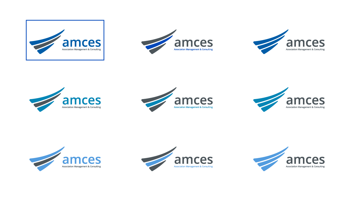
The final design features a triangle symbol made of three stripes, which create the feeling of advancing while representing the three layers of effective assoociations. It features simple, effective typography with clear hierarchy that allows for strong readability.
Typeface
Chosen for its strong readability, Open Sans is a typeface that helps communicate well while staying versatile for variety of scenarios.
Open Sans

Colours
The colour palette was chosen to connect with the old brand while creating a softer, more approachable feel for the new brand.
Primary
#00558cSecondary
#75787b