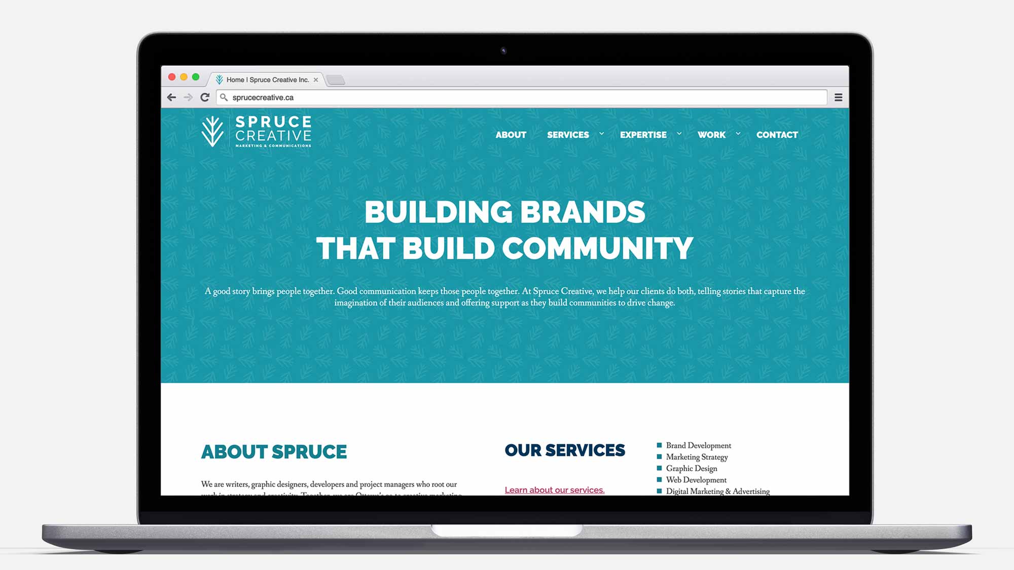
Case Studies
Spruce Creative's goal is to tell stories. When they work with a client they strive to capture who the client is and market them through true, authentic story telling. When designing the case studies, I created them to reflect that goal by telling the story of Spruce Creative's relationship with the client and how that story has evolved over time.
View the Run Ottawa case study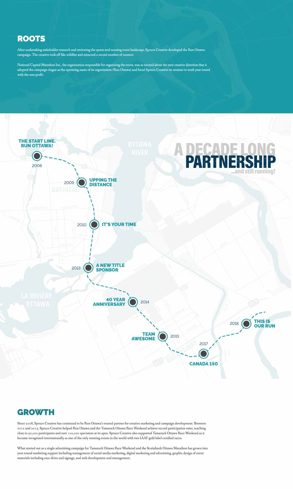
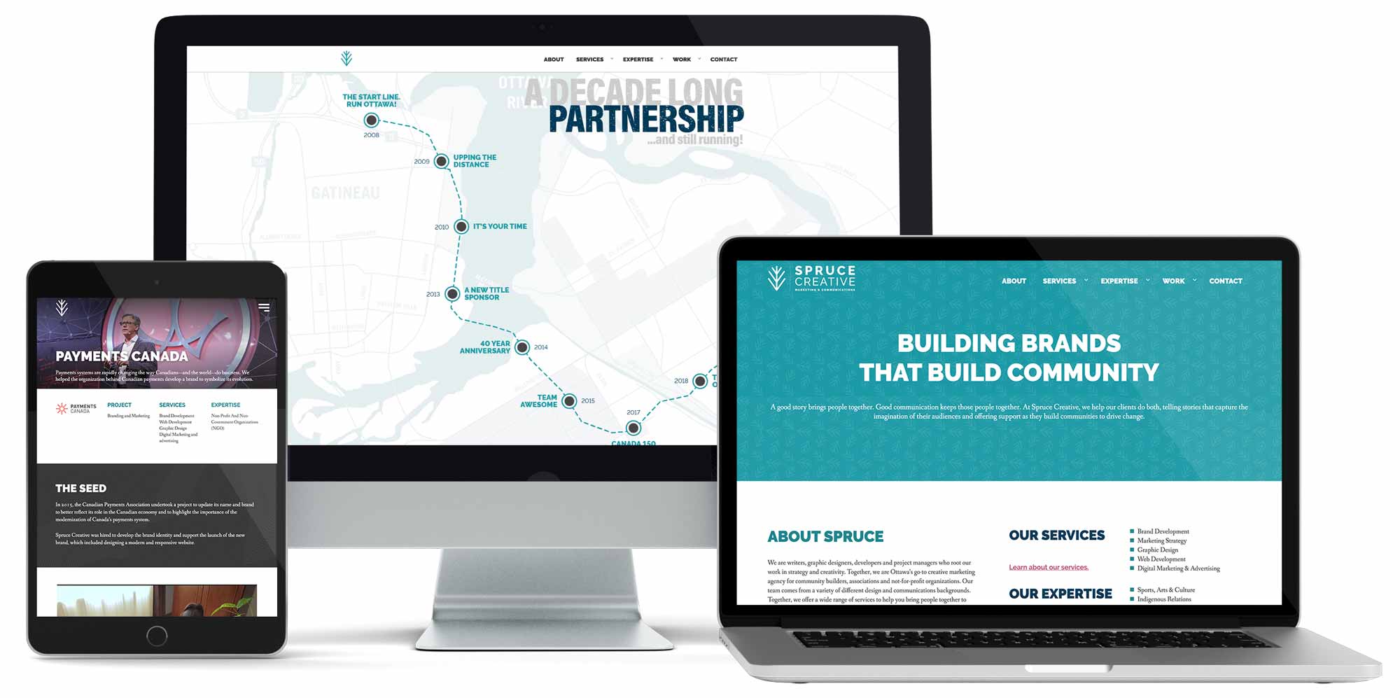
Visual Design
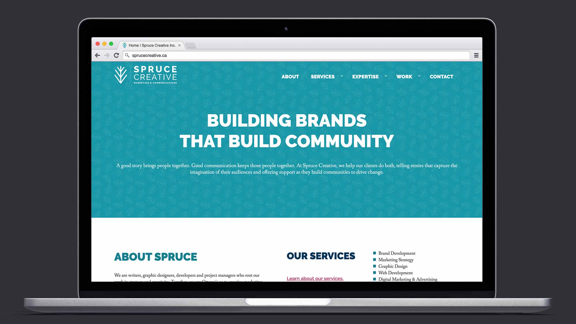
A large portion of the site is designed to demonstrate the work that Spruce Creative has done for their clients and a large number of pages a dominated by their clients' branding Therefore, it was very important in the design of this website to capture the personality of Spruce Creative's brand and find subtle ways to represent them on each page. This was accomplished through the heavy use of brand colours to categorize content, and to recreate texture patterns that both represent their clients and link back to Spruce Creative's design.
Typeface
Raleway ExtraBold is used for headers and emphasis, helping to create clear hierarchy within the content. Fanwood is used for body copy for easy readability.
Raleway

Fanwood

Colours
Spruce Creative had a pre-existing colour palette. Within the website they are used to organize case-studies by category, create hierarchy, and provide strong accents.

