

The Hub & Rebound
The Hub & Rebound are a charitable organization in Almonte, Ontario. In my role as the project lead, I oversaw the development of the new logos and brand, providing critiques and guidance. I also fully designed and developed the new website using Jekyll and Netlify.
Categories
- Branding
- Web Design
- Web Development
Client
Role
- Team Lead
- Designer
- Web Developer
Year
- 2018
Objective
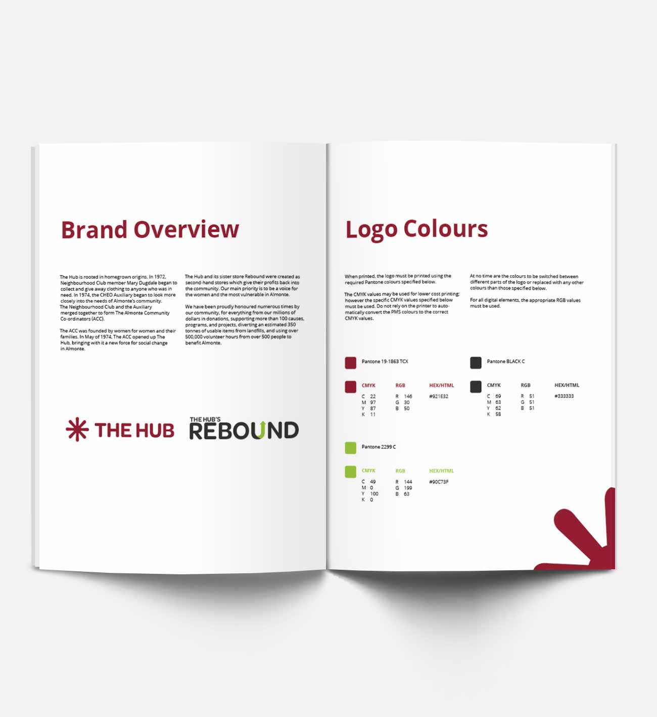
The client's rebrand objectives were to modernize The Hub's image while still feeling connected to the original brand. The Hub has a lot of history and emotional connection for a lot of people, therefore great care and consideration was needed when creating its new identity.


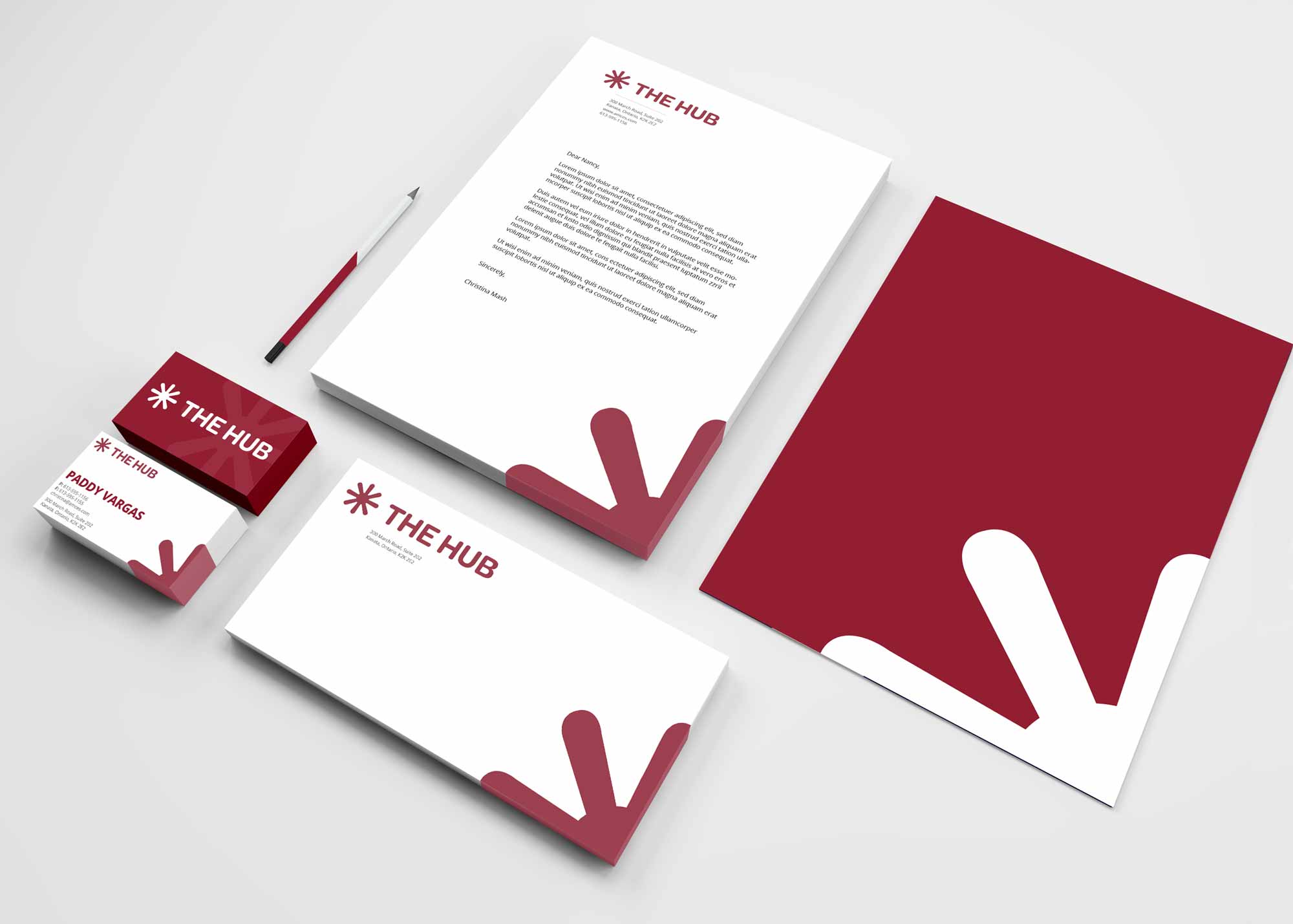
Logo Design
We created logos for both The Hub and Rebound. We aimed to create a pair of logos that felt connected but also were unique and functioned on their own. For The Hub, we took the hub wheel from the original, simplified it, and gave it clean wordmark. For rebound, we made a matching wordmark with a simple rebounding U shape for a simple but effective extra detail.
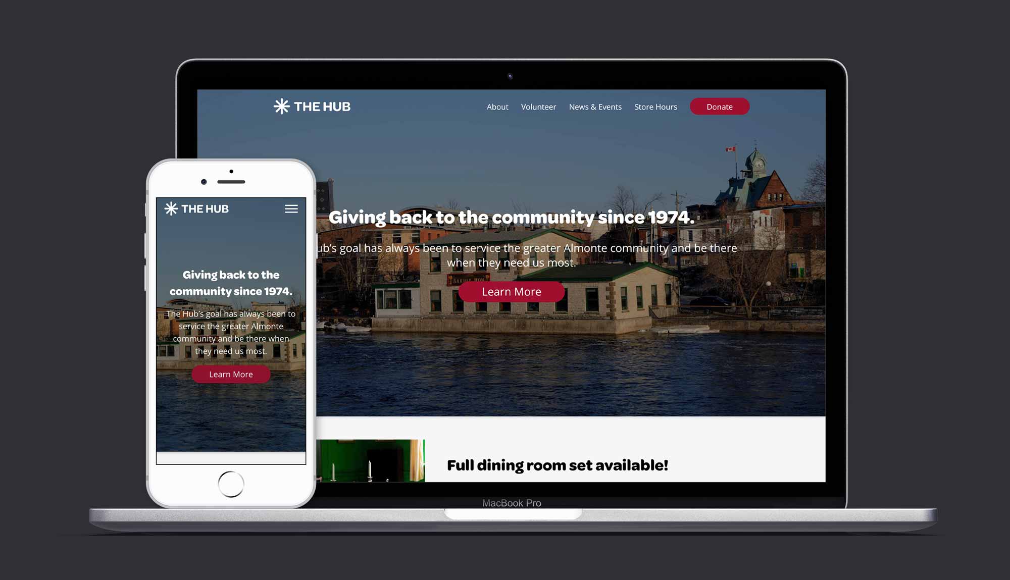
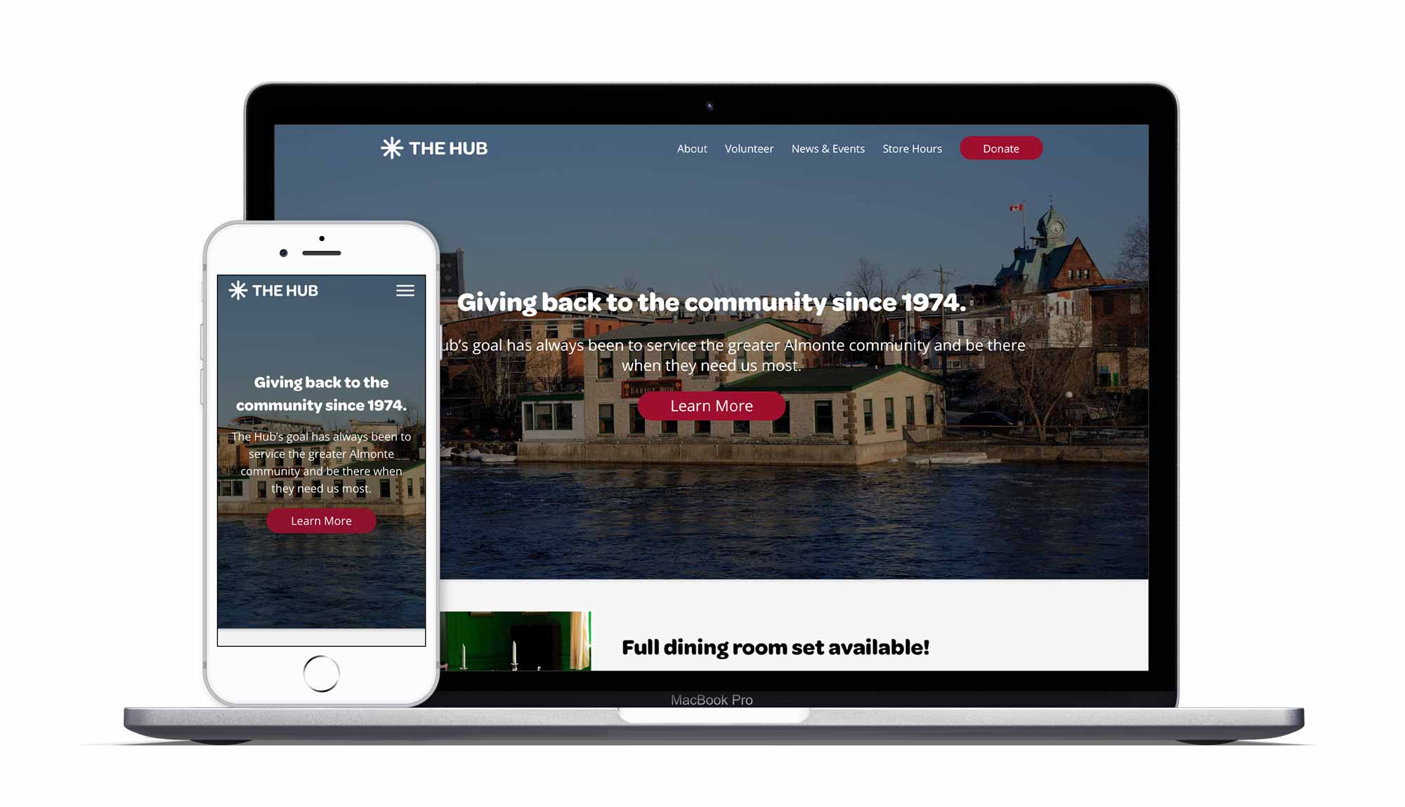
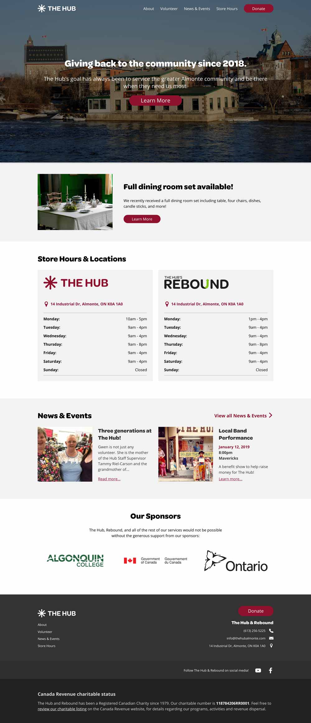
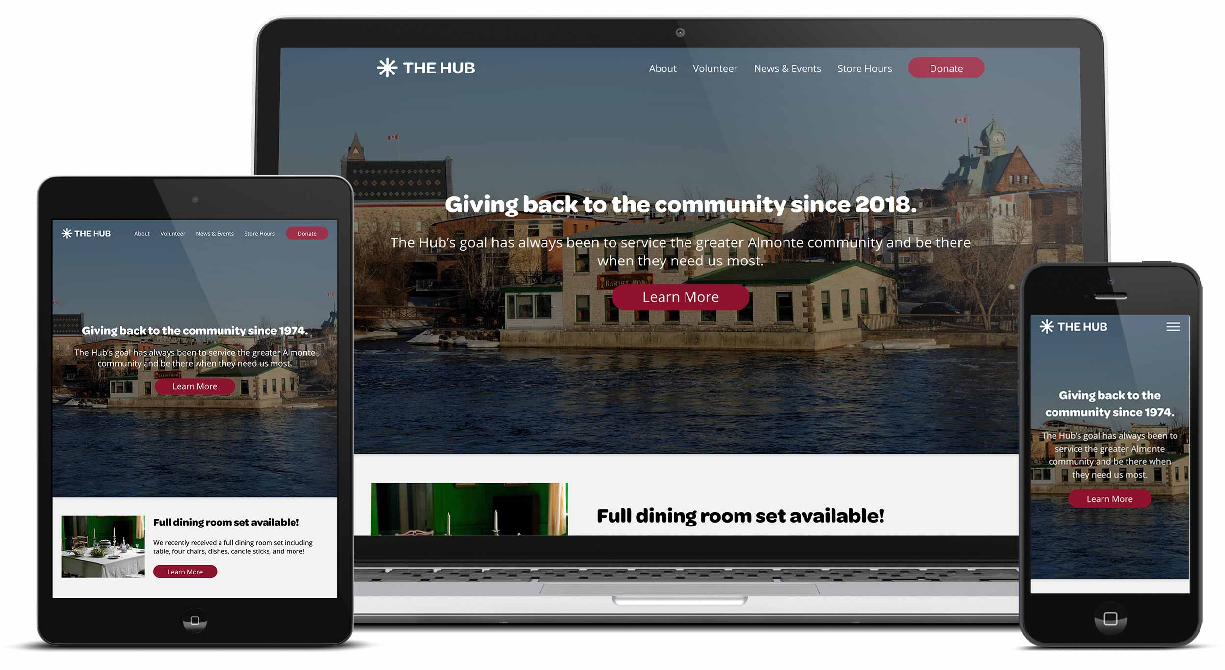
Web Design
For The Hub's new website, the most important factor was functionatlity and ease of use. The Hub's target audience are typically senoirs and other demographics that have limited computer experience. Therefore a focus was point on really clear grouping of content, easy navigation, and accessibility.
A big goal of the website was to better tell The Hub's history and give clear details on their services. To accomplish this, we created a detailed about page, which tells the story of their history and makes it easy for users to find information about their history, services, donations, and board.
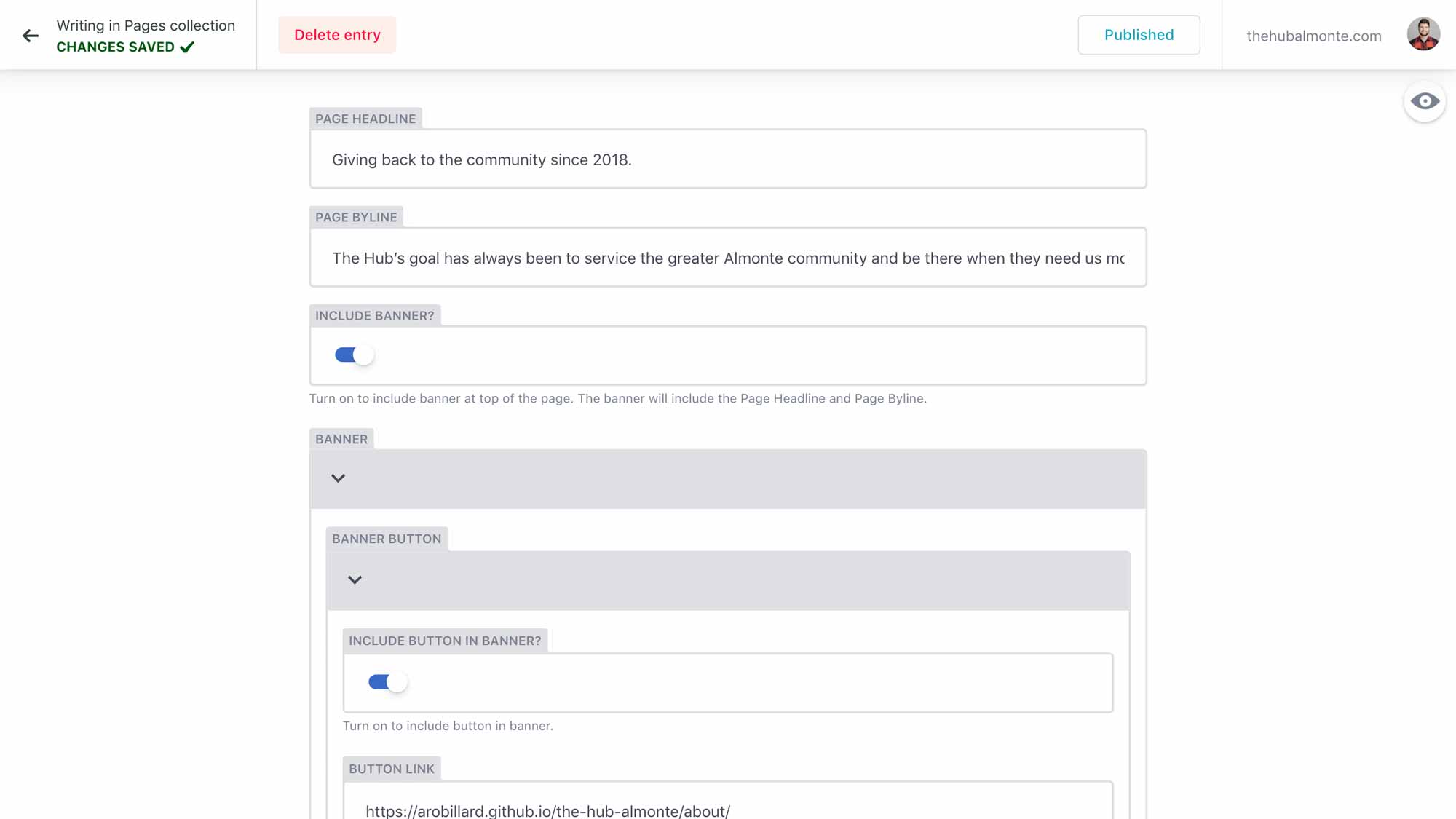
CMS Implementation
To allow customizability of the website for the client, I implemeted Netlify, a content management systems that builds the website with Jekyll. Netlify allows me as the developer to choose what areas the client will be able to change and update. This allows me to ensure the client can keep their content up to date, without having to worry about breaking their website.
Brand Design
The goal of The Hub's design was to modernize and simplify the brand and website. We created a strong, easily identifiable mark in the symbol that is versatile across all platforms. The brand is kept simple and clean, allowing it to be easily accessible and useable by all target audiences.
Typeface
The brand uses Omnes both in the wordmarks and for the headers on the website. The body copy is Open Sans, chosen for its strong readability.
Omnes

Open Sans

Colours
The colour palette is simple with different colours representing the two stores. Both stores share a dark grey secondary colour to help unify the brands.
The Hub
#8f102dRebound
#8fcc3aSecondary
#333