Québec Nordiques
The goal of the Quebec Nordiques rebrand was to modernize the brand and have it stand out as a competitive brand in the modern age National Hockey League (NHL). The Quebec Nordiques team was relocateed to Colorado in the mid-1990s therefore their brand design reflects the 90s design style. The rebrand modernizes the team’s look while still feeling connected with the original brand.
Logo Design
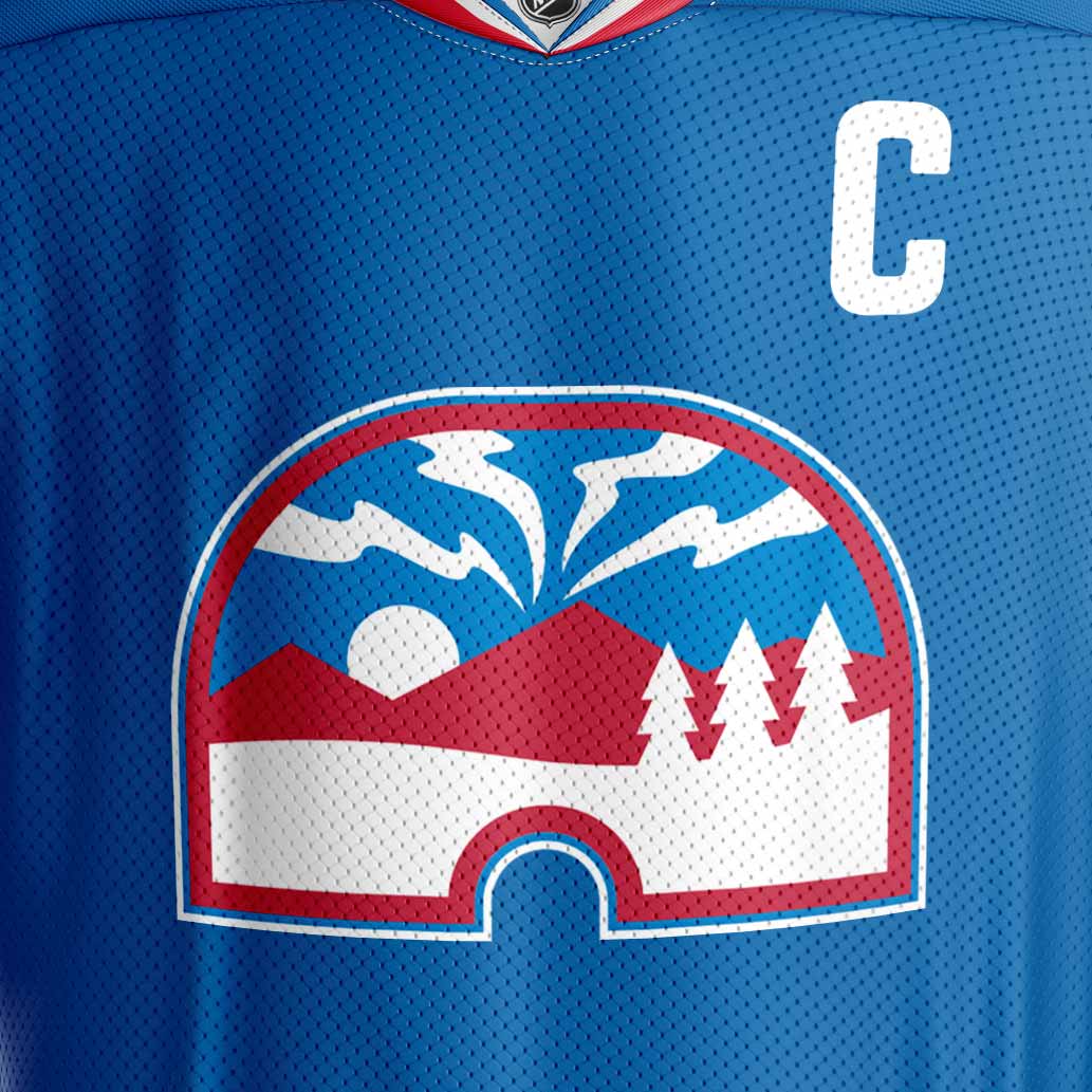
The new logo design pulls elements from the original, while more deeply exploring the northern themes. The shape of the logo is an igloo, adapted from the igloo “N” shape in the original logo. It features a winter mountain scene with the northern lights appearing in the sky. The goal of the logo is to create more connection with the north and to represent the northern Quebec landscape.

Jersey Design
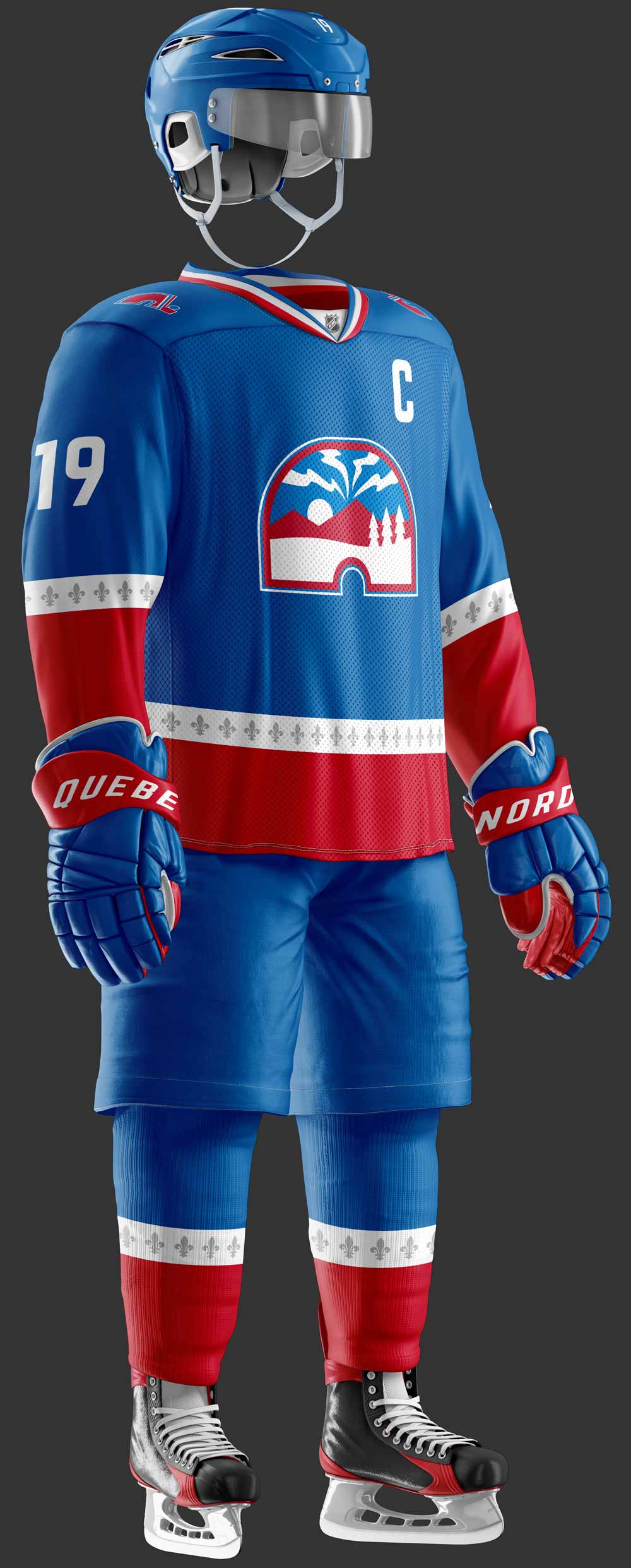
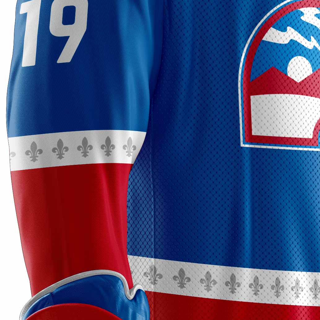
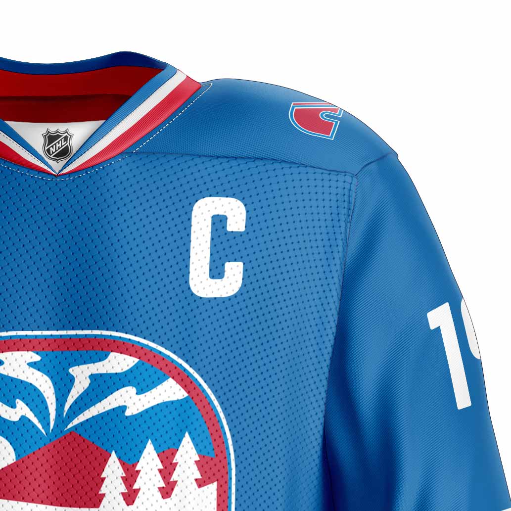
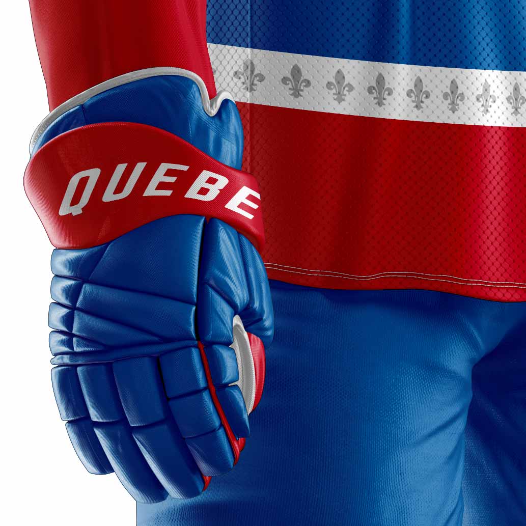
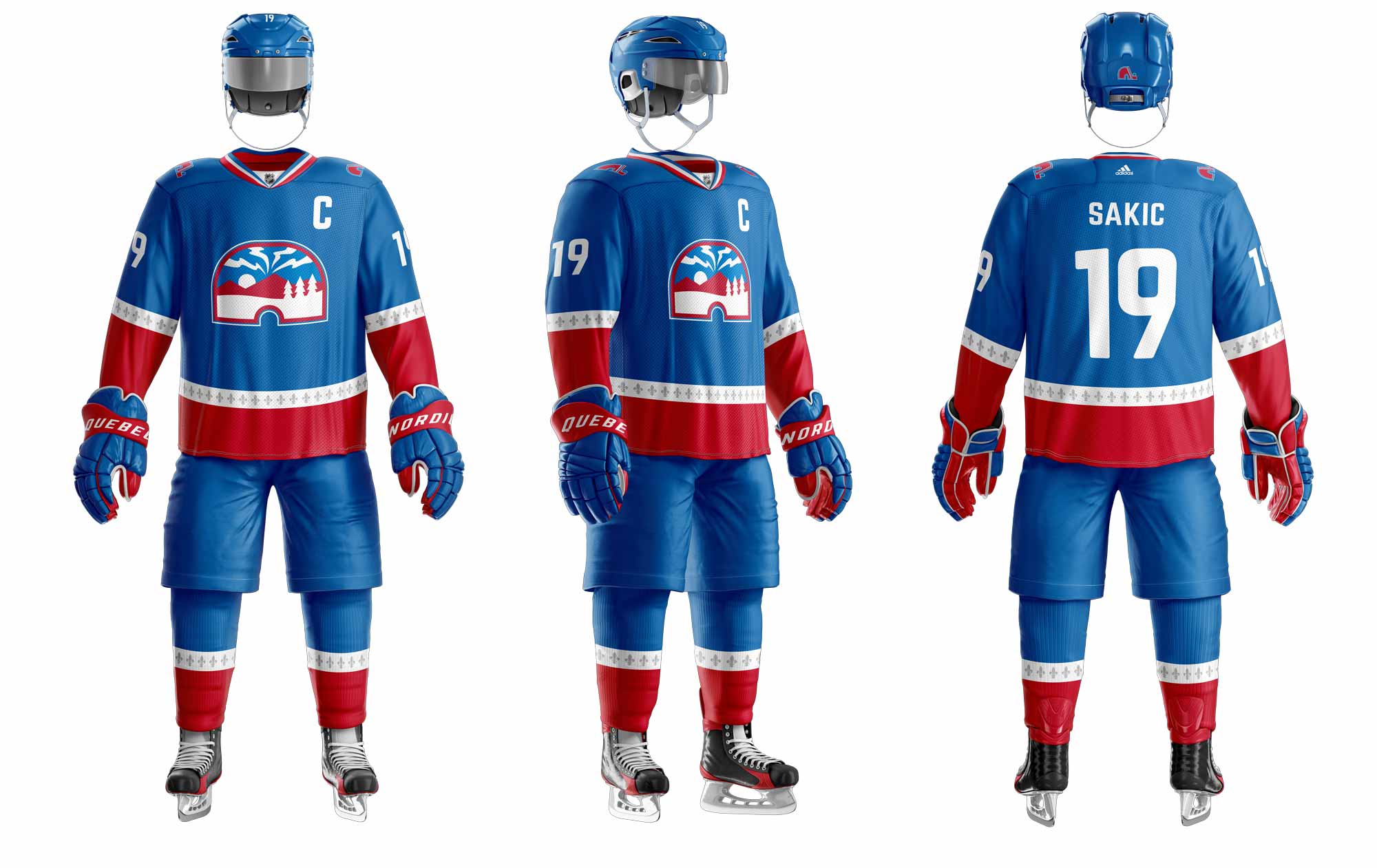
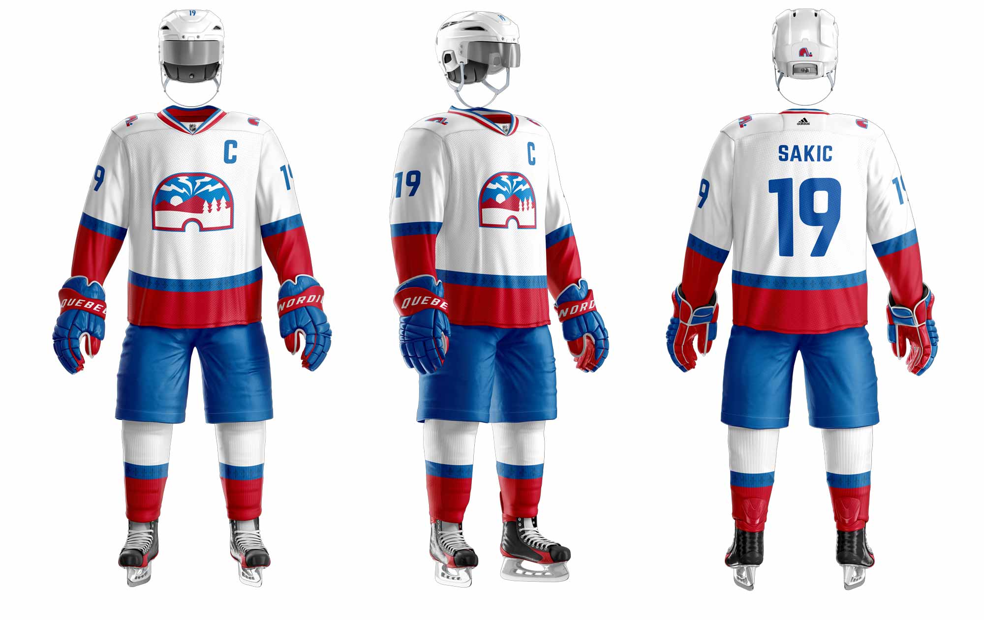
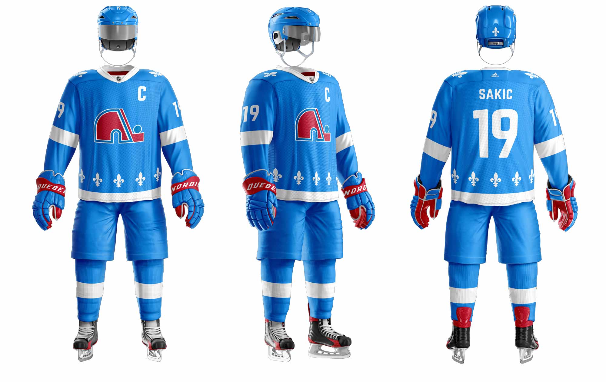
Designed to be simple and clean, the new jersey retains a blue, red and white colour palette. It boldy displays the new logo on the chest, while featuring the original logo on the shoulders as an homage to the team’s history. The jersey and socks are trimmed with red and a white strip with a pattern of fleur-de-lis to create more connection with the original brand and French heritage.
Home Jersey
Away Jersey
3rd Jersey
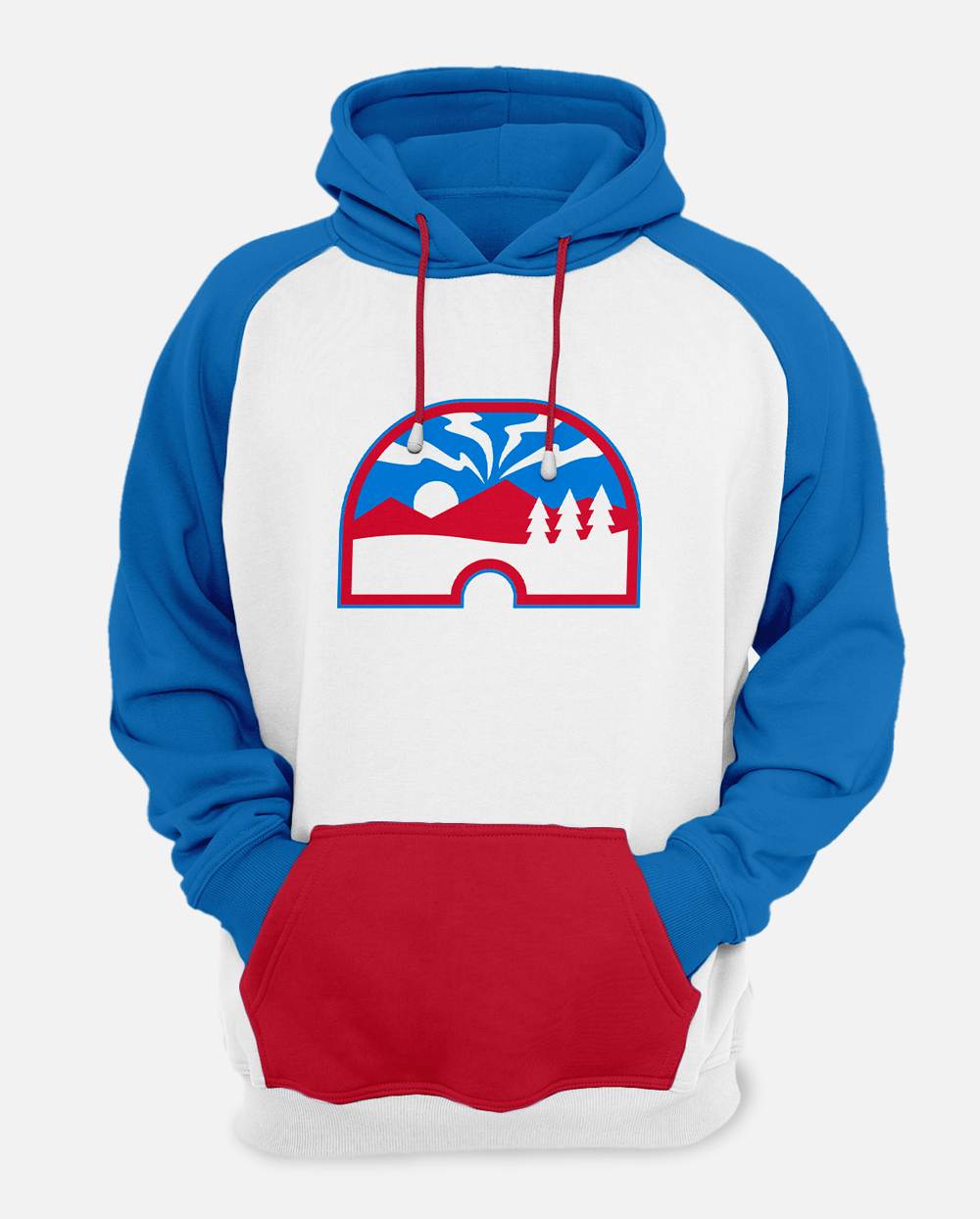
Merchandise
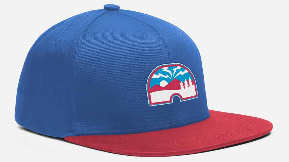
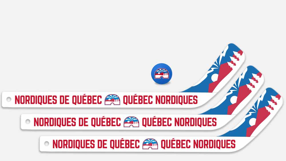
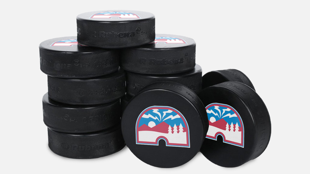
The updated logo design and brand transitions seamlessly into merchandising options. They can easily be used to create trendy clothing items such as hoodies and snapbacks, while also working well to create kids toys and essentials like hockey pucks.
