
What is Responsive Type?
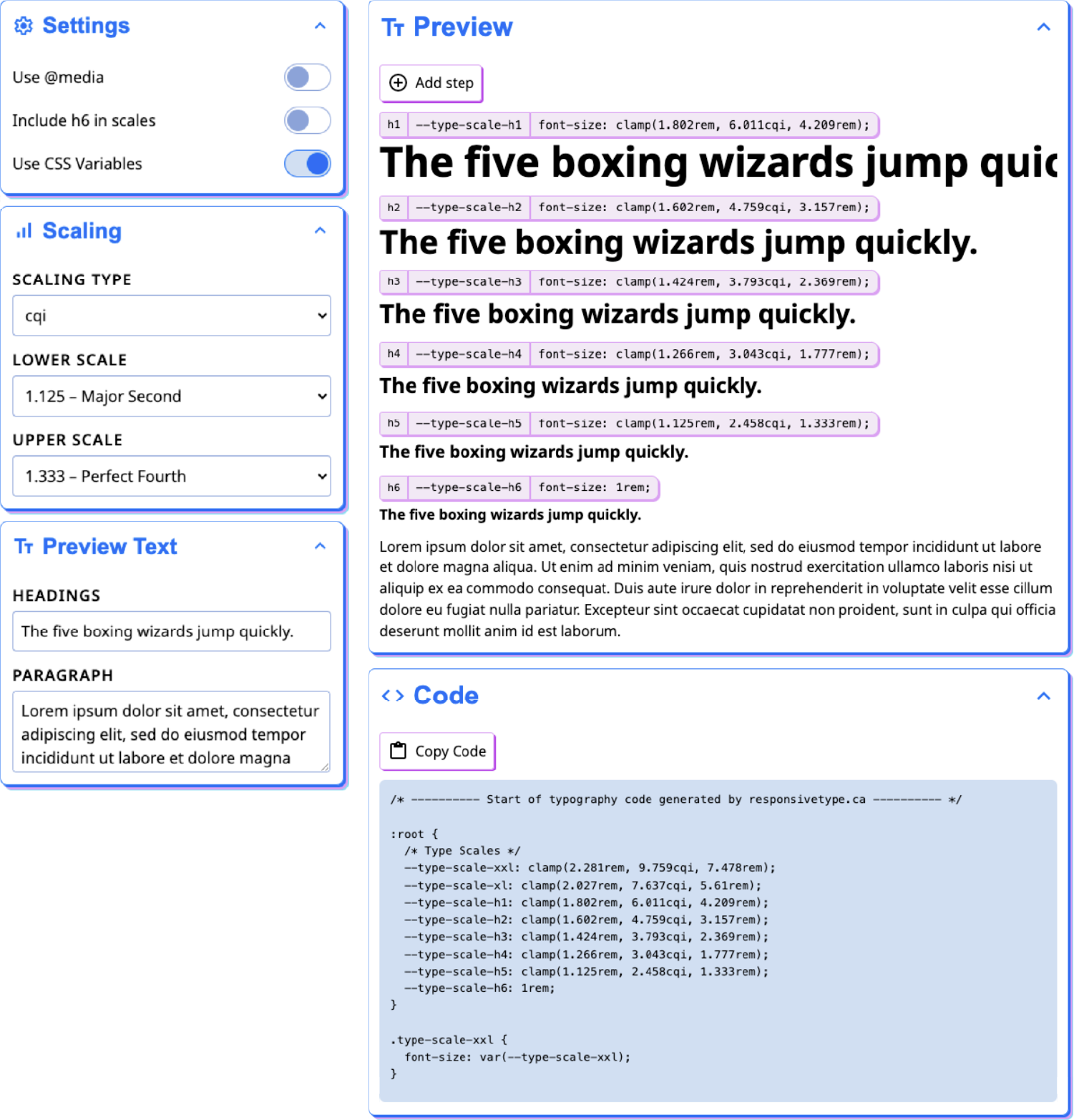
Responsive Type is an app that generates responsive type hierarchies for websites, simplifying the process of creating consistent type sizing across the entire website. Users can customize their hierarchy by choosing between fluid viewport/container size based font sizing or to set font sizes based on media query breakpoints and can set different scales to best suit their needs. The app also generates CSS code the users can copy to easily add the styles into their projects either by copying the entire CSS code block, or by copying a specific size from the preview.
Key Features
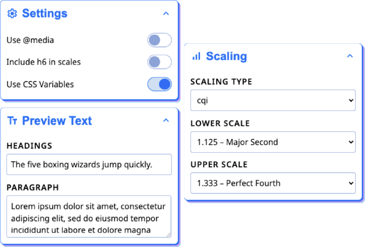
Configure Settings
Change the type scale at different screen sizes either through fluid viewport or container sizings or with specific media breakpoints.
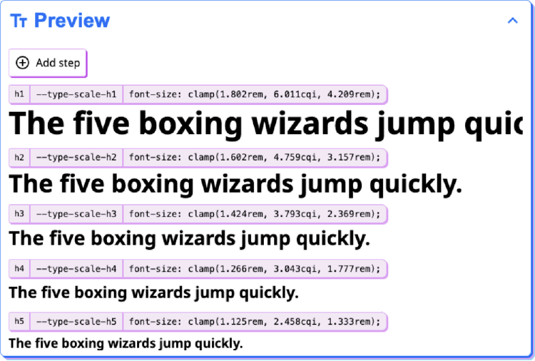
Preview Type Scales
Preview how your type scales will look, add more steps in your hierarchy, and copy CSS code for individual hierarchy steps.
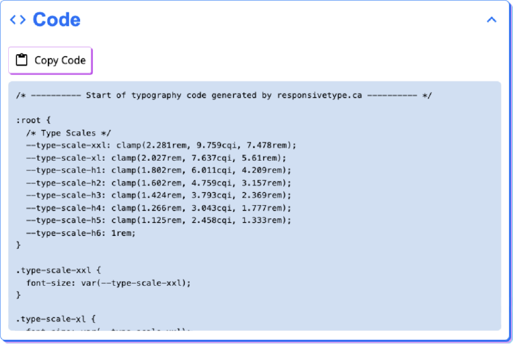
Copy Output Code
Review and copy generated CSS code that is ready to use in your project.
Why make it?
I used to use another tool to generate my type scales until it went freemium and locked the majority of the useful features behind a paywall. I figured instead of paying money for it, I would just make my own version. Doing so also gave me the opportunity to add features that specifically suited my own preferences and include more modern features like fluid type sizing.
Tech Stack
Responsive Type is built in Next.js and leverages the client-side features to create a fast, seamless interactive experience.
Responsive Type uses CSS Modules for its based styling and also uses the CSS code it generates in the previews to ensure consistency for users.